5 Color Palette Ideas for Websites That Look Professional
Your website can have excellent content, a fast load time, and a great layout, yet still feel unpolished if the colors don't work together. Color affects what visitors notice first, how easily they can read your content, and even whether your brand feels trustworthy or playful.
The good news? You don't need to be a designer to build a strong color system.
A thoughtful Colour palette gives every page a consistent visual identity. It can help your buttons stand out, make headings easier to scan, and create a more memorable brand experience. In this guide, you'll find five professional color palette ideas for websites, along with practical examples, RGB values, selection tips, common mistakes, and a simple process for creating your own palette.
Table of Contents
- 5 Color Palette Ideas for Websites That Look Professional
- What Makes a Website Color Palette Look Professional?
- 5 Professional Color Palette Ideas for Websites
- How to Choose the Right Color Palette for Your Website
- How to Use a Color Chart and RGB Color Values
- How to Build a Website Color Palette Step by Step
- Common Website Color Mistakes to Avoid
- Best Practices for Using Website Colors
- Frequently Asked Questions
- How many colors should a website palette have?
- What is the best color for a professional website?
- How do I choose colors that work together?
- What does RGB mean in web design?
- Should my website use the same colors on every page?
- Can I use bright colors on a professional website?
- What is the easiest way to test website colors?
- How can I make my website colors more accessible?
- Conclusion
What Makes a Website Color Palette Look Professional?
A professional website doesn't necessarily need muted colors, expensive branding, or a dozen carefully selected shades. In many cases, professionalism comes from consistency and restraint. When colors have clear jobs, visitors can understand the interface without consciously thinking about the design.
A useful palette usually includes a dominant background or brand color, a text color, one or two supporting shades, and an accent color for important actions. That structure creates visual order. Instead of every element competing for attention, the eye naturally moves from the most important information to the next.
The trick is to avoid choosing colors individually. A blue might look fantastic on its own but clash with the yellow you've selected for buttons. A pale green might seem attractive in a design tool but become difficult to read when placed behind small gray text.
That's why it helps to think of a palette as a team rather than a collection of individual players. Each color should have a role.
Balance Matters More Than the Number of Colors
There is no magic number of colors that makes a website professional. What matters is how those colors interact.
For many sites, three to five core colors are enough. You can then create lighter and darker variations for borders, hover states, backgrounds, and other interface details.
A simple structure might look like this:
| Role | Example |
|---|---|
| Primary | Deep navy |
| Background | White |
| Secondary | Soft blue |
| Accent | Bright teal |
| Text | Dark charcoal |
This approach makes design decisions easier because you aren't selecting a new color every time you create a section.
Start With a Clear Visual Hierarchy
Color should help visitors understand importance. Your primary heading, navigation, call-to-action button, and background shouldn't all demand equal attention.
Use stronger colors selectively. If every button is bright orange, every card has a different background, and every heading uses a different shade, nothing feels important anymore.
A restrained Colour palette acts like punctuation in writing. Bold colors can be the exclamation points, while neutral tones provide the sentences that make the whole message understandable.
5 Professional Color Palette Ideas for Websites
The following combinations are starting points rather than strict rules. You can adjust their brightness, saturation, and contrast to match your brand.
1. Navy, White, and Soft Blue

Best for: Business websites, technology companies, consulting firms, SaaS products, and professional services.
| Color | Hex | RGB |
|---|---|---|
| Navy | #12304A | 18, 48, 74 |
| White | #FFFFFF | 255, 255, 255 |
| Soft Blue | #DCEAF4 | 220, 234, 244 |
| Sky Blue | #4A90C2 | 74, 144, 194 |
| Charcoal | #263238 | 38, 50, 56 |
Navy has long been associated with stability and professionalism, which makes it a natural starting point for corporate or technology-oriented designs. Pairing it with white creates a clean foundation, while pale blue can soften large sections without making the page feel colorful for the sake of being colorful.
Use navy for headers, navigation, or important text. Reserve the brighter blue for interactive elements such as links and buttons. This creates a subtle hierarchy while keeping the overall design calm.
If you're building a financial service or consulting site, this palette can communicate confidence without looking overly formal.
2. Charcoal, Cream, and Warm Gold

Best for: Luxury brands, portfolios, restaurants, creative businesses, and premium services.
| Color | Hex | RGB |
|---|---|---|
| Charcoal | #252525 | 37, 37, 37 |
| Cream | #F7F1E5 | 247, 241, 229 |
| Warm Gold | #C49A3A | 196, 154, 58 |
| Soft Gray | #D9D6CF | 217, 214, 207 |
| White | #FFFFFF | 255, 255, 255 |
This combination works because it relies heavily on neutrals and uses gold as an accent rather than a dominant color. The result feels refined without requiring elaborate visual effects.
Try using cream as a background, charcoal for most text, and gold for small details such as icons, buttons, borders, or highlights.
The important part is restraint. Covering an entire website in gold can quickly become overwhelming. A small amount can feel intentional; too much can make the design feel heavy.
3. Forest Green, White, and Sage
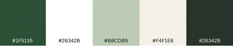
Best for: Wellness brands, environmental organizations, food companies, outdoor businesses, and lifestyle websites.
| Color | Hex | RGB |
|---|---|---|
| Forest Green | #1F5135 | 31, 81, 53 |
| White | #FFFFFF | 255, 255, 255 |
| Sage | #B8CDB5 | 184, 205, 181 |
| Light Cream | #F4F1E8 | 244, 241, 232 |
| Dark Text | #26342B | 38, 52, 43 |
Green gives you plenty of flexibility. Dark forest tones can feel established and sophisticated, while sage shades create a softer, more relaxed appearance.
This palette works particularly well when paired with natural photography, simple typography, and generous white space.
Use forest green for important brand elements and darker text. Sage can support cards or section backgrounds, while cream can break up large white areas.
4. Deep Purple, Lavender, and White
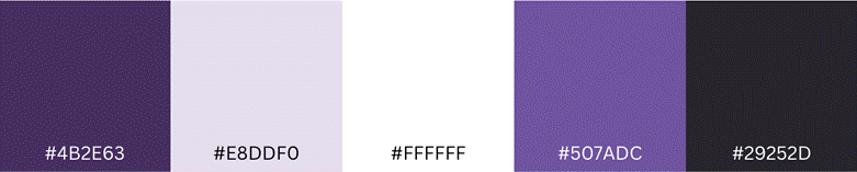
Best for: Creative agencies, education platforms, digital products, personal brands, and modern startups.
| Color | Hex | RGB |
|---|---|---|
| Deep Purple | #4B2E63 | 75, 46, 99 |
| Lavender | #E8DDF0 | 232, 221, 240 |
| White | #FFFFFF | 255, 255, 255 |
| Violet | #7653A6 | 118, 83, 166 |
| Dark Gray | #29252D | 41, 37, 45 |
Purple can make a website feel creative without becoming playful or childish. The key is choosing a sophisticated base shade and using lighter versions to create depth.
Deep purple works well for navigation and branding, while lavender can create gentle background areas. A stronger violet can then draw attention to selected actions.
For a creative business, this combination can give you more personality than the traditional blue-and-gray approach while still maintaining a polished appearance.
5. Charcoal, White, and Coral

Best for: Agencies, ecommerce stores, personal brands, media websites, and modern service businesses.
| Color | Hex | RGB |
|---|---|---|
| Charcoal | #222831 | 34, 40, 49 |
| White | #FFFFFF | 255, 255, 255 |
| Coral | #F26B5B | 242, 107, 91 |
| Light Gray | #F1F3F5 | 241, 243, 245 |
| Slate | #59636E | 89, 99, 110 |
Coral introduces energy without requiring a neon color. Against charcoal and white, it becomes an obvious accent that can guide visitors toward important actions.
Try using coral for calls to action, selected navigation items, or small visual highlights. Keep most of the page neutral so the accent retains its impact.
This approach demonstrates an important principle: a professional palette doesn't have to be boring. One strong accent can give a website considerable personality.
Choosing the Right Color Palette for your Website
The best palette isn't necessarily the one that looks best in a color picker. It is the one that supports your brand, audience, content, and user interface.
Consider Your Brand Personality
Start by describing your brand in three to five words.
Is it:
- Trustworthy?
- Energetic?
- Calm?
- Premium?
- Friendly?
- Innovative?
- Natural?
Then select colors that reinforce those qualities.
A healthcare website might benefit from calm blues and greens. A children's education platform may have more room for bright colors. A luxury brand might lean toward dark neutrals with a restrained accent.
Color doesn't communicate your entire brand by itself, but it contributes to the first impression.
Think About Your Audience
Ask who will use the website and what they expect from it.
A professional accounting firm and a creative photography studio don't need to look alike. Their audiences arrive with different expectations, and the design should support those expectations rather than follow whatever color trend happens to be popular.
Define Your Primary and Accent Colors
Choose one dominant brand color and one accent color before adding secondary shades.
Your primary color can establish identity. Your accent can guide attention.
For example:
Primary: Navy
Secondary: Pale blue
Accent: Teal
Neutral: White
Text: Charcoal
That gives you enough flexibility without creating unnecessary complexity.
How to Use a Color Chart and RGB Color Values
A Colour chart can help you compare shades and understand how colors relate to one another. Instead of choosing colors based only on what looks good on your monitor, you can examine their values and create a repeatable system.
Understanding RGB Color Values
RGB colour refers to a color represented using three components: red, green, and blue. Each channel is commonly represented by a value from 0 to 255.
For example:
RGB(255, 0, 0) represents red.
RGB(0, 0, 0) represents black.
RGB(255, 255, 255) represents white.
Changing those three values produces millions of possible colors.
You don't need to calculate these values manually. A digital color picker can identify the value associated with a color you like.
Turning a Color Into a Reusable Website Value
Suppose you find a blue you love in a photograph. You can use a color picker to sample it, identify its code, and then add that color to your website's design system.
This makes the process much more consistent.
Instead of telling a designer, "Use the blue from our homepage," you can provide a specific color value. Developers can then reproduce it accurately in CSS and other design tools.
How to Build a Website Color Palette Step by Step
Creating your own palette doesn't have to take hours. Follow this straightforward process.
Step 1: Choose Your Main Color
Start with the color most closely connected to your brand.
Step 2: Select a Neutral
Choose white, off-white, light gray, charcoal, or another neutral shade for backgrounds and text.
Step 3: Add a Supporting Color
Create a lighter or darker variation of your main color, or choose a complementary shade.
Step 4: Select an Accent
Pick one color for buttons and important interactive elements. Don't make every component an accent.
Step 5: Check Your Contrast
Look at text against its background at the actual sizes you'll use. Small text needs particular care.
Step 6: Evaluate the Palette on the Webpage
A palette can look excellent as five small color swatches and still feel wrong when applied to a complete webpage. Test it on a header, body text, cards, buttons, and footer.
Step 7: Record Your Color Codes
Save the HEX and, when useful, RGB values. This prevents slight variations from appearing across pages.
Common Website Color Mistakes to Avoid
One of the biggest mistakes is choosing too many colors. More options don't automatically create more personality. They often create visual noise.
Another problem is using low-contrast text. A pale gray font on a white background might look elegant in a design mockup but can become difficult to read.
Don't rely on color alone to communicate meaning, either. If a form field is invalid, for example, don't indicate the problem only by turning its border red. Include text or another clear visual indicator.
Also avoid changing colors randomly from one page to another. Consistency helps users understand how your interface works.
Finally, don't follow trends blindly. A fashionable palette may look impressive today but become dated later. Start with your brand and audience instead.
Best Practices for Using Website Colors
A good Colour palette should make your website easier to use, not simply prettier.
Keep these principles in mind:
- Give every color a job. Know whether a shade is for backgrounds, text, buttons, borders, or branding.
- Limit your core colors. A small system is easier to maintain.
- Prioritize readable text. Visual style should never come at the expense of usability.
- Use accent colors strategically. Save strong colors for important actions.
- Test across devices. Colors can appear different depending on displays and settings.
- Maintain consistency. Reuse established colors rather than inventing new ones for every component.
- Consider accessibility. Make sure users can distinguish important information without relying entirely on color.
- Record your codes. Keep HEX and RGB values documented for future design work.
A color picker can make the practical side of this process much easier because you can identify and save exact shades instead of guessing.
Frequently Asked Questions
How many colors should a website palette have?
There is no fixed number, but a small set of core colors is often easier to manage. A primary color, neutral shades, supporting color, and accent can provide plenty of flexibility without making the interface chaotic.
What is the best color for a professional website?
There isn't one universal answer. Navy, blue, green, charcoal, and other restrained colors can work well, but the right choice depends on your industry, audience, brand personality, and design.
How do I choose colors that work together?
Start with a primary color, then add neutrals and one accent. Use a Colour chart or digital color picker to explore related shades and compare combinations before applying them to your website.
What does RGB mean in web design?
RGB stands for red, green, and blue. An RGB colour value describes how much of each channel contributes to a displayed color, typically using values from 0 through 255.
Should my website use the same colors on every page?
Yes, consistency is generally helpful. Your core colors should remain recognizable throughout the website, although you can use lighter or darker variations to distinguish different sections.
Can I use bright colors on a professional website?
Absolutely. Bright colors can work well when used selectively. A vivid accent against a neutral background can create energy while keeping the overall design controlled.
What is the easiest way to test website colors?
Use a color picker to identify exact shades, then test them in real interface elements such as headings, buttons, backgrounds, and body text. Don't judge the palette only from isolated color swatches.
How can I make my website colors more accessible?
Pay close attention to text-to-background contrast, don't rely on color alone to communicate information, and test important interface elements under different viewing conditions.
Conclusion
A professional website doesn't need a complicated design system. The strongest results often come from a small, deliberate Colour palette where every shade has a clear purpose. Whether you choose navy and blue for a corporate site, forest green for a wellness brand, or charcoal and coral for a creative business, consistency and readability should guide your decisions.
Use a Colour chart to explore combinations, check exact RGB colour values when you need consistency, and test your choices in a real webpage before committing to them.
Ready to find the perfect shade for your website? Try our free online color picker to identify colors, explore color values, and build a palette that fits your brand.