Free Online Color Wheel - Create Harmonious Color Schemes | FreeOnlineColorPicker
Table of Contents
- What Is Free Online Color Wheel?
- How to Use the Color Wheel Tool
- Real-World Use Cases
- Key Features
- Comparison with Other Tools
- Frequently Asked Questions
What Is Free Online Color Wheel?
A browser-based digital tool helping artists, designers, and everyone perfect color picker. Not just a color chart – it's a smart guide showing which colors work well together (that's Color Harmony).
It's like having a magic palette that suggests harmonious color combinations for your projects, without needing to be a color expert. You can understand it better with these 3 main points:
- Free and No Download Required: As the name suggests, it's completely free to use. You don't need to pay anything or install any heavy software on your computer or phone.
- Blend of Technical and Creative: This tool gives you technical color codes (like HEX, RGB) instead of just color names, so you can use them accurately in your website, social media post, or painting.
- Simplified Color Theory: The tool works on complex Color Theory rules behind the scenes, but presents it as a beautiful "wheel" that you can spin with your fingers to explore thousands of color combinations.
How to Use the Color Wheel Tool
Step 1: Open the Tool
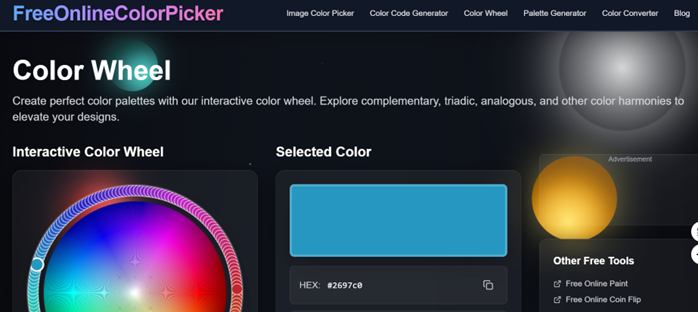
First, open the color wheel online tool in your browser. You'll see a circle of colors right away – that's the paint color wheel. The best part? No account needed, no login hassle. Just open the page and start creating.
Step 2: Pick Your Base Color
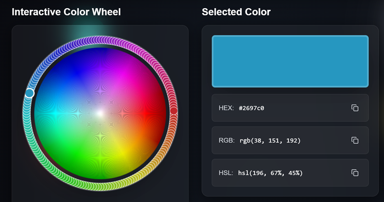
Click anywhere on this color spectrum wheel to choose the color you want to start with. As you move the cursor, color values will change. Tip: Outer edges have deep, vibrant colors; as you move to the center, colors get lighter and pastel.
Step 3: Set Color Harmony
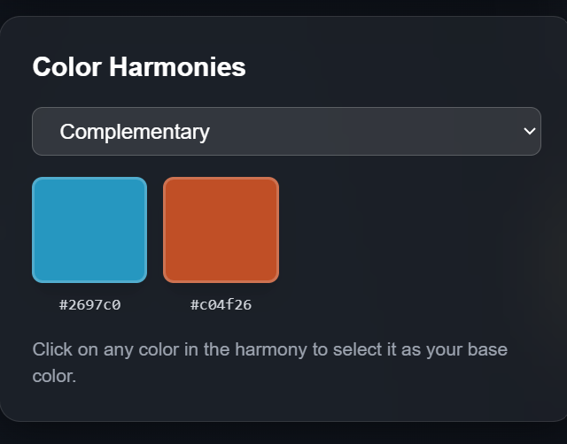
This is where the color harmony wheel's magic happens. You'll see options like "Complementary" or "Analogous". These are ways pros match colors:
- Complementary: Opposite colors (for strong contrast).
- Analogous: Adjacent colors (for soothing harmony).
- Triadic: Three equally spaced colors (balanced and vibrant).
- Split-Complementary: Base color + two shades flanking its opposite.
- Tetradic: Four colors forming a rectangle.
Pick one, and this color matching tool finds matching colors for your base.
Step 4: Fine-tune Your Palette
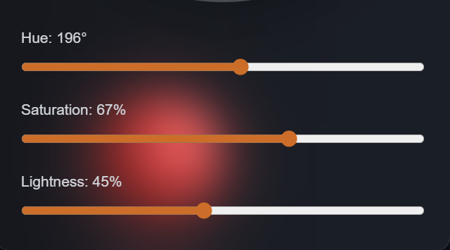
With colors picked, tweak them. Use sliders in this color palette maker to adjust brightness and saturation.
Step 5: Copy Color Codes
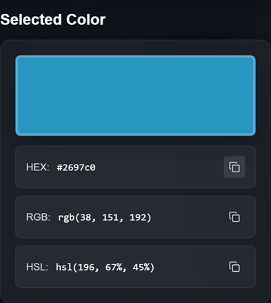
When you like the shades, click a color. The tool gives HEX codes and RGB values. Paste these into your website, app, or design software.
Step 6: Save Your Work
Most people screenshot their final palette or note down codes. Your brand color palette ready for future projects or to share with your team.
Real-World Use Cases
1. Crafting a Brand Identity
Heenashi, a freelance graphic designer. She had to brand a coffee shop wanting "warm yet modern, earthy yet classy." Sounds contradictory, right? Heenashi picked a deep "coffee-brown" on color wheel for designers. Knowing plain brown could bore, she used a brand color picker. With split-complementary harmony, the tool suggested a light teal and a cute coral.
Now she had a story: earth (brown), water (teal), sunrise (coral). Using color branding generator brightness sliders, she created 5 shades of each. Result? A create brand colors system perfect for signs, social media, and coffee cups.
2. Planning a Dream Wedding
Picking wedding colors is toughest. Khushaal and siya wanted their autumn wedding romantic yet unique. siya loved deep burgundy; khushaal liked gold. They used this tool as a wedding color palette generator.
Starting with burgundy, they picked analogous harmony. This colour wheel maker nailed it. Paired burgundy with "burnt orange" and "marigold gold". Not just on screen – they gave HEX codes to florists for matching flowers and to bakers for themed cake icing. Thanks to color harmony wheel, everything – clothes to table decor – looked cohesive.
3. Beautifying a Home Inside
David bought his first home and was clumped picking wall paints. The store had thousands of shades looking same-same. He needed a paint color wheel showing the whole room.
He started with favorite "sage green". On colour matching tool, he made an analogous palette – "olive" for main walls, light "mint" for ceiling. But he needed neutrals too. He used saturation slider, pulling colors towards gray, getting whites and beiges with green hints.
This color theory tool helped when picking sofa cushions and paintings. He put wall colors and picked coral accessories via complementary harmony. Without this tool, he'd never think green and coral would fit so well.
Key Features
1. Super Easy to Use (Intuitive Wheel)
The heart of this online color wheel picker is its "wheel". Just move your finger or cursor on this chromatic wheel and colors change automatically. The interface is big and clean – no straining your eyes to pick shades.
2. Color Harmony at a Click (Harmony Modes)
Not just a random html color code generator. It has algorithms understanding color relationships. Need complementary or triadic colors? One click and this color spectrum wheel marks colors that go well together.
3. Full Brightness & Saturation Control
A good color palette maker knows picking colors isn't enough. Use sliders to decide how dramatic or pastel your color is. Make colors pop or mute them as needed.
4. Codes Ready for Every Platform
Building a website or working in Photoshop? Get HEX codes, RGB values, HSL codes – all formats you need for digital or physical work.
5. No Downloads Needed
Browser-based colour wheel tool – no memory hog. Bookmark this page. Access this color wheel for designers anywhere – office, home, paint shop.
6. Instant Code Copy
Click a color, code copies automatically. No typing long numbers/letters. Saves time using your brand color palette everywhere.
7. Real-Time Preview
Change something on color harmony wheel, palette updates instantly. No "process" or "load" wait. Real-time feedback makes creative work fast and fun.
8. Clean Interface
No annoying ads or "premium" plans interrupting work. This make a colour wheel interface is kept clean so you focus on colors, distraction-free.
Other Tools vs Our Color Wheel
Market's got loads of color tools, but which one's right for you? Let's see what the big names do and why we stand out:
When you pick a tool, your needs come first. Here's what some popular ones do:
- Adobe Color: Great if you're deep in Adobe's ecosystem (Photoshop, Illustrator). Best for big teams sharing palettes via cloud.
- Coolors: Loves trendy palettes and a modern look. Its random generator sparks ideas when you're stuck.
- Paletton: A bit advanced, granular control for complex color harmonies.
Why Choose Us?
Wondering why pick us? Our professional-grade color wheel for designers gives you something others often miss: simplicity + accessibility, no fuss.
- No account hassle.
- No "premium feature" paywalls.
We see it as a tool that works perfectly without fluff.
1. No Barrier to Entry
Tools like Adobe Color ask you to create an account or log in before touching colors. Not this color wheel online tool. No forms, no email confirm. You land on the page, start picking colors in seconds.
2. True Color Theory
Apps like Coolors generate random palettes via algorithms. Our tool's built on traditional color theory tool principles. You see the classic color wheel chart artists've used for ages. Benefit: you pick colors + understand why they work together. It's a tool + a tiny lesson.
3. Focused Simplicity
Lots of tools overload you with features (image color extract, mobile apps) – the point gets lost. This tool focuses on one thing: helping you make your own colour wheel palette and pick harmonious colors.
4. Super Smooth to Use (Responsive Interface)
Paletton's good too, but interface feels a bit old-tech. Ours is modern and smooth. The wheel's big, responds instantly to clicks. Using it feels like playing with colors, not running heavy software.
5. Freedom to Pick Formats
Most tools give codes; our html color code generator makes copying + using them super easy. The "quick-copy" feature saves precious time so you focus on design, not data wrangling.
Frequently Asked Questions
Q: Do I need to create an account to use this color wheel online?
A: No account is necessary. This online color wheel picker works immediately in your browser without registration, login, or payment. Bookmark the page for instant access whenever you need it.
Q: What's the difference between complementary and analogous colors?
A: Complementary colors sit opposite each other on the color wheel chart—like blue and orange, or red and green. They create high contrast and vibrant, energetic combinations. Analogous colors sit next to each other—like blue, blue-green, and green. They create smooth, harmonious, cohesive color schemes. The color harmony wheel helps you visualize both relationships.
Q: Can I use the colors I create here for commercial projects?
A: Yes. Colors themselves cannot be copyrighted (with very rare exceptions for specific branded colors like Tiffany Blue in specific contexts). The brand color palette you create with this tool is yours to use freely in personal or commercial work.
Q: How do I save the palettes I create?
A: Currently, the best method is to copy all the color codes into a document or take a screenshot of your palette. Unlike some tools with account-based saving, this colour matching tool focuses on immediate usability. Many designers keep a running document of palettes for different projects or clients.
Q: What color format should I use for my website?
A: For web design, HEX codes (like #FF5733) are the standard and what this html color code generator provides first. They work in CSS, HTML, and all web design tools. RGB values also work well for web use. The tool provides both formats for flexibility.
Q: Why don't some color harmonies look good together?
A: Color harmony is part science, part art. The color scheme designer provides mathematically harmonious relationships, but factors like saturation levels, brightness, and personal/cultural associations affect perception. This is why the brightness and saturation sliders matter—you can maintain the harmonic relationship while adjusting the colors to feel more balanced to your eye.
Q: Can I upload an image to extract colors from?
A: The core tool focuses on the color spectrum wheel interface for building palettes from scratch. For image color extraction, you'd need a different tool or browser extension, though many designers use this color wheel palette creator to refine and expand palettes they've extracted elsewhere.
Q: What makes this different from just using a basic color picker?
A: Basic color pickers let you choose one color at a time with no guidance on what works together. This adobe color theory inspired tool automatically suggests harmonious companion colors based on proven design principles. It's the difference between picking random paint swatches and having a color consultant show you coordinated options.
Q: Is this tool good for print design or just digital?
A: The color palette maker works for both digital and print. However, remember that RGB colors (what screens display) look different from CMYK colors (what printers use). For critical print work, always request physical proofs. The colors you see on screen through this tool are RGB and may shift slightly in print.
Q: How do I choose between triadic and tetradic color schemes?
A: Triadic schemes (three colors evenly spaced) tend to feel vibrant and balanced but aren't overwhelming—great for playful, energetic designs. Tetradic schemes (four colors forming a rectangle) offer more variety but require careful balancing to avoid looking chaotic. Start with triadic for most projects; use tetradic when you need a broader color vocabulary for complex designs.
Q: Can I use this on my phone or tablet?
A: Yes! This colour wheel tool is responsive and works on mobile devices. The touch interface works well for selecting colors on the wheel. Many designers use it while shopping for paint, fabric, or supplies to check color harmonies on the spot.
Q: What if I need a very specific shade I saw somewhere else?
A: If you have the HEX or RGB code from another source, you can manually enter it into the color branding generator section of most browsers' developer tools while viewing the wheel, though direct input depends on the specific implementation. Alternatively, use the wheel to get visually close, then fine-tune with the brightness and saturation sliders.
Q: Are there color combinations I should avoid?
A: From a technical standpoint, the good color combinations suggested by the harmony modes are all sound. However, consider context: red and green can look Christmas-themed, certain color pairings have cultural meanings, and some combinations (like certain reds and blues) can vibrate unpleasantly at full saturation. The tool gives you harmonious options; your judgment and the brightness/saturation controls let you refine them for your specific use.
Q: How often is this tool updated?
A: As a web-based color wheel online tool, updates and improvements can be deployed without requiring any action from users. The core color theory principles the tool is built on don't change (the paint color wheel has remained consistent for centuries), but interface improvements and feature additions happen periodically.
Q: Can I suggest new features?
A: Most tools welcome user feedback. Look for contact information or feedback forms on the website. Common feature requests for colour wheel maker tools include: palette saving functionality, image color extraction, color blindness simulation, and team collaboration features.