HSL Color Wheel Explained: Easy Guide to Hue, Saturation & Lightness for Designers
Introduction
Have you ever looked at a color code and wondered what it actually looks like? To be honest, HEX codes are fine for computers, but for us humans, understanding them is a headache. This is where HSL comes in.

HSL stands for Hue, Saturation, and Lightness. It's a way of understanding colors the way we talk about them in real life. We don't say we want a hashtag FF0000 red rose; we say we want a deep red rose. HSL works exactly like that.
Let's break down HSL:
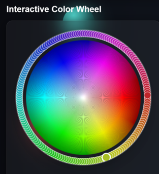
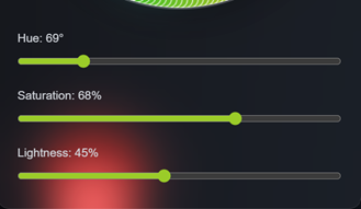
- Hue means which color it is - think of it as your position on a color wheel. Red, blue, green - these are all hues.
- Saturation means how deep or vibrant the color is. If saturation is 100%, the color is very vivid. If it's 0%, the color becomes grey.
- Lightness means how light or dark the color is. Do you want a light shade or a deep shade?
Why do I use HSL instead of HEX? Suppose you've chosen a blue color for your website, but it's too bright. If you're using HEX, you'll have to find a new code. But with HSL, you can just lower the saturation a bit and you're done. If text is hard to read, just increase the lightness a little. Playing with colors becomes so easy with HSL that you'll start feeling like a designer.
The best part is that on free online color tool https://freeonlinecolorpicker.com/free-online-color-wheel, when you upload a photo, it gives you not just HEX but also HSL codes. This tells you how vibrant and deep the beautiful colors in that photo really are.

What is the HSL Color Model?
HSL stands for Hue, Saturation, and Lightness. These are the three things that make up every color you see on your screen. The easiest way to understand it is to start looking at colors from a designer's perspective instead of memorizing codes. It's much easier and more fun than memorizing HEX codes.
1. "Hue" - What is the Real Color?
Hue means the pure color, like we say red, blue, green, or yellow. In the HSL color model, this is measured in degrees from 0 to 360. 0 or 360 is red, 60 degrees is yellow, 120 is green, 240 degrees is blue.
For example, if you upload a sunset photo to an image color picker online tool, it will tell you that the hue is around 20 degrees or 45 degrees. This tells you the color family.
2. "Saturation" - How Vivid or Dull the Color Is
Saturation tells you how deep or vibrant the color will appear. It's measured from 0% to 100%.
- "0%" is completely gray (no color)
- "50%" is medium depth
- "100%" is fully vivid and pure color
Pro tip: Professional designers know that too much saturation can be tiring on the eyes. 40% to 70% saturation gives a classic and calm feel to designs. If you extract colors from image online, notice that in good photography, saturation is often in this range.
3. "Lightness" – Darkness or Brightness
Lightness determines how bright or dark a color will appear. It also ranges from 0% to 100%:
- 0% is completely black
- 50% is the true, pure form of the color
- 100% is completely white
If you're at "50% lightness", you see the actual color. Below 50%, you get darker shades of that color. Above 50%, you get lighter shades (tints).
You've probably seen this while editing photos on your phone – adjusting the slider changes the lightness to create different shades.
Benefit: Suppose you extract a blue color from a photo using a color picker from image. By simply adjusting the lightness (without changing the hue), you can create multiple shades suitable for different parts of your website.
Why HSL is Better Than RGB and HEX
If you've ever tinkered with RGB or HEX codes, you know how frustrating it can be — change one number and the whole color turns into something weird. HSL solves this problem in a brilliant way. Here's why it's becoming the first choice for every designer:
1. Intuitive Adjustment
In HSL, making a color lighter or darker is child's play. Just adjust the Lightness value. If the color feels too intense, lower the Saturation. Want a different shade within the same family? Slightly tweak the Hue. This makes editing feel natural and effortless.
2. Better for Accessibility
A good designer is one whose work can be easily read by everyone. For this, having the right contrast between the background and text is very important. With HSL, you can easily check if your text is clearly visible by looking at the lightness difference and adjusting it. When you extract colors from image online, you can instantly fix its lightness and set it accordingly.
3. Consistent Color Relationship
In HSL, creating color combinations that look good together is very easy.

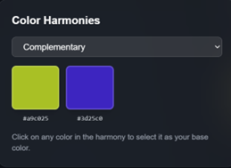
- Complementary – Colors that are 180 degrees apart on the color wheel.
- Analogous – Colors within 30 to 60 degrees of each other.
- Triadic – Three colors equally spaced at 120-degree intervals.
In short, HSL gives you control over colors that other methods can't provide. It's not just a code; it's a smart way to play with colors.
How to Use the HSL Color Wheel Effectively
The HSL color wheel is your roadmap to professional color selection. Here's how to master it:

Step 1: Choose Your Base Hue
Start by selecting your primary color on the wheel. If you're using a color picker from image, upload your brand logo or inspiration photo. The image color picker online will identify the dominant hue, giving you a starting point for your entire palette.
For example, if you're designing for a health and wellness brand, you might choose a hue around 120° (green) to convey freshness and growth. For a tech startup, blues around 210-240° communicate trust and innovation.
Step 2: Adjust Saturation for Mood
Once you have your hue, adjust saturation to match your design's personality:
- High saturation (70-100%): Energetic, youthful, attention-grabbing. Perfect for call-to-action buttons, children's content, or sports brands.
- Medium saturation (40-70%): Balanced, professional, versatile. Ideal for corporate websites, e-commerce platforms, and educational content.
- Low saturation (10-40%): Sophisticated, elegant, minimal. Best for luxury brands, portfolios, and editorial designs.
Use an HTML color picker online tool to preview these adjustments in real-time before committing to your design.
Step 3: Control Lightness for Hierarchy
Lightness creates visual hierarchy in your designs. Here's a professional approach:
- Primary color: 45-55% lightness (true color)
- Backgrounds: 90-98% lightness (very light tints)
- Text on light backgrounds: 10-30% lightness (dark shades)
- Accents: 35-45% lightness (medium-dark shades)
- Hover states: Adjust lightness by 10-15% from the base color
When you create a color palette from image, this lightness variation ensures your design has depth and dimension without introducing too many different hues.
Creating Professional Color Palettes with HSL
Building a cohesive color palette is where HSL truly shines. Let's explore proven color harmony techniques:
Monochromatic Palettes
Use a single hue with varying saturation and lightness:
- Base: H: 210°, S: 60%, L: 50%
- Light: H: 210°, S: 40%, L: 85%
- Dark: H: 210°, S: 70%, L: 30%
- Accent: H: 210°, S: 80%, L: 60%
This approach works beautifully when you extract colors from image online and want to expand one dominant color into a full palette. Monochromatic schemes look sophisticated and are hard to mess up.
Complementary Palettes
Choose hues 180° apart on the color wheel:
- Primary: H: 200° (blue), S: 60%, L: 50%
- Complement: H: 20° (orange), S: 60%, L: 50%
Adjust lightness to create variations. Use the RGB hex picker from image feature to find complementary colors in existing designs you admire.
Analogous Palettes
Select 2-3 hues within 30-60° of each other:
- Base: H: 180° (cyan), S: 50%, L: 50%
- Neighbor 1: H: 150° (teal), S: 50%, L: 50%
- Neighbor 2: H: 210° (sky blue), S: 50%, L: 50%
This creates harmonious, nature-inspired palettes perfect for wellness, environmental, or lifestyle brands.
Triadic Palettes
Use three hues evenly spaced at 120° intervals:
- Color 1: H: 0° (red), S: 60%, L: 50%
- Color 2: H: 120° (green), S: 60%, L: 50%
- Color 3: H: 240° (blue), S: 60%, L: 50%
Triadic schemes are vibrant and balanced. Lower the saturation to 40-50% for a more professional look.
Best Tools for Working with HSL Colors
Online Color Pickers
Modern online color picker tools make HSL adjustments effortless. Look for tools that offer:
- Real-time HSL sliders
- Visual color wheel representation
- Multiple export formats (HSL, RGB, HEX)
- Color palette from image extraction
- Accessibility contrast checking
One excellent option is using an image color picker online service like freeonlinecolorpicker.com, which automatically generates HSL values when you upload photos.
Browser Developer Tools
Most modern browsers include built-in color pickers with HSL support:
- Right-click any element on a webpage
- Select "Inspect" or "Inspect Element"
- Click the color square in the CSS panel
- Switch to HSL mode
- Adjust values and see changes instantly
This is particularly useful when you need an HTML color picker tool for web development projects.
Extracting Colors from Images
When you extract colors from image online, you're typically seeing RGB or HEX values first. Here's how to convert them to HSL for easier manipulation:
- Upload your image to a color extractor from image tool
- Select the colors you want to extract
- Copy the HEX or RGB values
- Use an HTML color picker online converter
- Switch to HSL view to see hue, saturation, and lightness values
This workflow lets you steal colors from any photograph, logo, or design and recreate them with precise HSL control.
Practical Applications of HSL Color Theory
Web Design and Development
HSL is incredibly powerful for CSS styling. Instead of defining multiple color variables, you can create dynamic color systems:
:root {
  --primary-h: 210;
  --primary-s: 60%;
  --primary-l: 50%;

  --primary: hsl(var(--primary-h), var(--primary-s), var(--primary-l));
  --primary-light: hsl(var(--primary-h), var(--primary-s), 70%);
  --primary-dark: hsl(var(--primary-h), var(--primary-s), 30%);
}
This approach, combined with a good color palette tool, makes maintaining and updating your site's color scheme remarkably easy.
Brand Identity Design
When creating brand guidelines, HSL values communicate more clearly than HEX codes:
Example Brand Color System:
- Primary Blue: H: 215°, S: 65%, L: 48%
- Light Blue (backgrounds): H: 215°, S: 45%, L: 92%
- Dark Blue (headers): H: 215°, S: 70%, L: 28%
- Accent Orange: H: 25°, S: 80%, L: 55%
This format helps designers understand relationships between colors and makes it easier to create new variations when needed.
Social Media Graphics
Platform-specific design often requires multiple color variations. Using HSL, you can quickly adapt your brand colors:
Instagram Story Template:
- Background: H: 340°, S: 45%, L: 95% (soft pink)
- Text: H: 340°, S: 60%, L: 20% (deep burgundy)
- Accent: H: 340°, S: 70%, L: 55% (vibrant rose)
Start with one hue and adjust saturation and lightness for each element. You can extract colors from image online from your best-performing posts to identify winning color combinations.
UI/UX Design
HSL excels at creating interactive states for buttons and links:
- Default state: H: 210°, S: 60%, L: 50%
- Hover state: H: 210°, S: 60%, L: 40% (darker)
- Active state: H: 210°, S: 70%, L: 45% (more saturated)
- Disabled state: H: 210°, S: 20%, L: 70% (desaturated, lighter)
This consistent approach creates intuitive, accessible interfaces.
The Future of Color Selection with HSL
As design tools are becoming more advanced, HSL is no longer just an option — it's becoming a core part of every designer's workflow.
Modern color picker tools online have become much smarter. They don't just pick colors, they do a lot more, like:
1. AI Magic
AI now uses HSL rules to automatically create color palettes that look perfect together. You just have to upload a photo, and AI does the rest.
2. Instant Accessibility Check
Tools now give real-time scores on how comfortable your chosen color is for the eyes and whether everyone can read it easily.
3. Smart Dark and Light Mode
You no longer need different colors for light and dark mode. With just one HSL value, you can create an entire website theme for both light and dark modes.
4. Color Blind Simulation
With HSL adjustments, it's now easy to see how your design will look for people with color vision difficulties, making your work better for everyone.
5. Smart Color Suggestions
Tools now suggest which colors will work best with your chosen main color for the best UI.
In short, color selection will no longer be a guessing game. HSL, combined with smart technology, will make it so easy that anyone can work like a professional designer.
Conclusion
Mastering the HSL color wheel transforms you from someone who "picks colors" into someone who "designs with color." Understanding hue, saturation, and lightness gives you precise control over every color decision while keeping the creative process intuitive and enjoyable.
Whether you're using a color picker from image to extract inspiration from photographs, building brand guidelines with an HTML color picker online tool, or creating social media graphics with an online color picker tool, HSL is your secret weapon for professional, harmonious color palettes.
The beauty of HSL is its simplicity. You don't need to memorize thousands of color codes or rely on trial and error. With three simple values – hue, saturation, and lightness – you can create, adjust, and perfect any color combination your project requires.
Start experimenting with HSL today. Upload an image to a color extractor from image tool, examine the HSL values, and try creating variations by adjusting just one parameter at a time. You'll quickly develop an intuitive understanding of how colors work together, and your designs will show the difference.
Remember: great design isn't about using the most colors – it's about using the right colors in the right relationships. HSL gives you the framework to do exactly that, every single time.
Frequently Asked Questions
1. What's the difference between HSL and HSV color models?
HSL (Hue, Saturation, Lightness) and HSV (Hue, Saturation, Value) are similar but differ in how they handle brightness. In HSL, 50% lightness gives you the pure color, while 100% is always white. In HSV, 100% value gives you the pure color. HSL is more intuitive for designers because adjusting lightness predictably makes colors lighter or darker. When using an online color picker tool, HSL is generally more useful for practical design work.
2. How do I convert HEX colors to HSL values?
Most modern HTML color picker online tools offer instant conversion. Simply paste your HEX code into a color palette tool and switch the display format to HSL. For manual conversion, you'll need to first convert HEX to RGB, then apply the HSL formula. However, using an image color picker online service makes this process automatic and instant.
3. Can I use HSL colors directly in CSS?
Yes! Modern browsers fully support HSL in CSS. Use the syntax: color: hsl(210, 60%, 50%); or with alpha transparency: color: hsla(210, 60%, 50%, 0.8);. This is particularly powerful when creating CSS variables and dynamic color systems. Many developers prefer HSL over HEX when working with an HTML color picker tool because adjustments are more intuitive.
4. What's the best saturation level for professional designs?
Professional designs typically use 40-70% saturation for main colors. Brand colors often sit around 50-65% saturation, providing vibrancy without overwhelming the viewer. High saturation (80-100%) should be reserved for small accent elements or call-to-action buttons. When you extract colors from image online from professional websites, you'll notice this pattern consistently.
5. How do I create a dark mode palette using HSL?
Start with your light mode colors and adjust the lightness values inversely. For dark mode: reduce background lightness to 10-20%, increase text lightness to 85-95%, and adjust accent colors to 55-65% lightness. Keep hue and saturation relatively consistent. A good color picker from image tool can help you test these adjustments before implementation.
6. Why do my HSL colors look different on different screens?
Screen calibration, color profiles, and display technology affect color appearance. HSL defines colors consistently, but physical display limitations vary. Always test your color palette from image on multiple devices. Use an online color picker tool to ensure your colors meet accessibility standards across different viewing conditions.
7. How can I extract HSL values from a photograph?
Use an image color picker online service that supports HSL output. Upload your photo, click on colors you want to extract, and the tool will provide HSL values. Tools like freeonlinecolorpicker.com automatically show HSL, RGB, and HEX formats simultaneously when you extract colors from image online, making it easy to work with any format you prefer.
8. What hue values work best for different industries?
Different hues evoke different emotions and suit different industries: Blues (200-240°) work for tech, finance, and healthcare; Greens (120-160°) suit environmental, health, and wellness brands; Reds/Oranges (0-30°) energize food, entertainment, and sports brands; Purples (270-300°) convey luxury, creativity, and spirituality. Use a color palette tool to explore these hue ranges.
9. How do I ensure my HSL colors are accessible?
Check lightness contrast between text and backgrounds – aim for at least 40-50% difference. Use an HTML color picker tool with built-in accessibility checking. For WCAG AA compliance, ensure a 4.5:1 contrast ratio for normal text, 3:1 for large text. Many online color picker tools now include automatic accessibility scoring.
10. Can I create gradients using HSL values?
Yes, and HSL makes gradient creation much more intuitive than RGB. Keep saturation and lightness constant while gradually shifting hue for rainbow effects, or keep hue constant while adjusting lightness for smooth tonal gradients. When you color picker from image from beautiful gradient designs, you'll notice they often follow these HSL-based patterns for natural-looking transitions.
11. How do I match colors from a competitor's website using HSL?
Take a screenshot of the competitor's site and upload it to an image color picker online tool to extract colors from image online. The tool will provide HSL values that you can then modify – shift the hue by 10-20°, adjust saturation by 10-15%, or change lightness to create similar but distinct colors. This approach using a color picker from image helps you understand successful color strategies while maintaining your brand's uniqueness. Never copy colors exactly; instead, use them as inspiration to create your own palette with an online color picker tool.
12. What's the ideal lightness range for background colors in web design?
For light themes, use backgrounds with 95-100% lightness and very low saturation (5-15%) to avoid color fatigue. For dark themes, keep backgrounds at 8-15% lightness with similarly low saturation. Content areas should be slightly different – perhaps 92-97% for light mode or 12-18% for dark mode. When you extract colors from image online from professional websites using a color palette tool, you'll notice they rarely use pure white (100%) or pure black (0%) as these can be harsh on the eyes.
13. Can I use HSL to create seasonal color variations for my brand?
Absolutely! HSL makes seasonal adaptations simple while maintaining brand recognition. Keep your brand's core hue but adjust saturation and lightness seasonally. Spring: increase lightness to 60-70% with medium saturation (50-60%); Summer: use high saturation (70-80%) with moderate lightness (55-65%); Fall: warm the hue by 10-15° and use 45-55% saturation; Winter: decrease saturation to 30-40% with lower lightness (40-50%). Use an HTML color picker online tool to preview these variations before implementing them across your marketing materials.
14. How do I create color-blind friendly palettes using HSL?
Color-blind accessibility requires more than just hue changes – focus on lightness contrast. Ensure at least 30-40% lightness difference between important elements, regardless of hue. Avoid relying solely on red-green distinctions (0° vs 120°); instead, pair them with significant lightness or saturation differences. Use a color palette from image that includes blues (210-240°), oranges (20-40°), and yellows (50-60°) which are more universally distinguishable. Many online color picker tools now include color-blind simulation features to test your palette before finalizing.
15. What's the best way to document HSL colors for a design system?
Create a structured naming convention that includes the color's purpose and HSL characteristics. For example: "primary-blue-h210-s60-l50" or organize by lightness scale: "blue-900 (darkest)" through "blue-100 (lightest)". Document base HSL values in your style guide and show how they're adjusted for different use cases. When using a color extractor from image or HTML color picker tool during brand development, immediately record both the HSL values and their intended applications. This documentation makes it easy for team members to color picker from image references and maintain consistency across all platforms.